Is Having a Logo Embarrassing Now?
Why corporate and civic rebrands have become flashpoints for public fury.
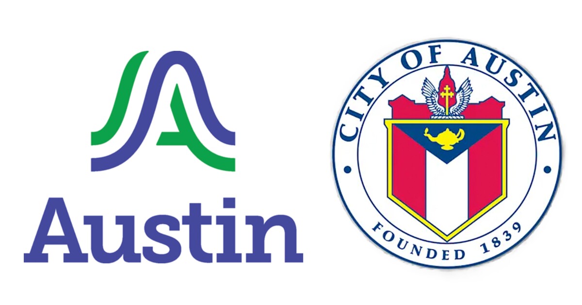
This fall, the City of Austin unveiled its new logo. I live here, so I watched the response unfold in real time. It was immediate and brutal. "It looks like a homeless tent." "This is exactly what is wrong with this city." The Mayor of Keller, a suburb of Dallas, tweeted that all the consultants did was "Chat GPT the Dallas logo." A Change.org petition gathered thousands of signatures. Local news anchors gleefully demonstrated that they could generate comparable alternatives using AI in seconds.
The logo itself is fine. It's a stylized "A" rendered in two intersecting arches, colored blue and green, with "Austin" set in a respectable serif font. It replaced a century-old heraldic seal that featured a cross, wings, and a yellow oil lamp meant to represent knowledge and education. The old mark was the kind of ornate civic crest that looks distinguished on a flag and illegible on a website. By any reasonable design standard, the new mark is cleaner, more versatile, more suited to digital applications. None of this mattered. What mattered was the price tag: $1,117,558. What mattered was the timing: the logo was unveiled on September 4th, just weeks before voters were asked to approve Proposition Q, a twenty-percent property tax increase to address a thirty-three-million-dollar budget deficit. What mattered was the optics of a city government spending a million dollars on a graphic while its citizens struggled with rent and unanswered 911 calls.
On November 4th, voters rejected Proposition Q by a margin of sixty-three to thirty-seven percent. At the opposition's victory party, the attorney who'd funded the campaign against the measure declared: "Quit with the million-dollar logos. Quit with the trips to Japan. Quit wasting the taxpayer money." The logo had become a symbol of institutional dysfunction. Not because of anything wrong with the design, but because of everything it revealed about the institution that commissioned it.
This is the new reality of corporate and civic identity work: the rebrand has become embarrassing. Not always, and not inevitably, but with a frequency and intensity that would have seemed bizarre even a decade ago. In the past year alone, we've watched Jaguar lose ninety-seven percent of its European sales after launching a campaign that didn't feature any cars. We've watched Cracker Barrel reverse its logo change within a week after its stock dropped a hundred million dollars in a single day. We've watched the Scottish investment firm, Aberdeen (fka Abrdn), restore the vowels it had paid 1.5 million pounds to remove. The pattern is consistent enough to constitute a phenomenon: organizations announce changes to their visual identity, the internet convulses with mockery, and executives scramble to contain damage that often proves irreversible.
The question is why. Why now? Why has the logo redesign, once a routine exercise in corporate maintenance noticed mainly by design bloggers and brand consultants, become a flashpoint for public fury?
The Speed of Embarrassment
The easiest answer is social media, and it's not wrong. Platforms have compressed the feedback loop between institutional action and public reaction to essentially zero. When Gap unveiled a new logo in 2010, fourteen thousand parody redesigns appeared within days. A protest Twitter account gathered five thousand followers in twenty-four hours. The company reversed course in six days. That was considered remarkably fast at the time. Now it's the baseline expectation. "You're going on TikTok," observed Timothy Calkins, a marketing professor at Northwestern's Kellogg School, "and your whole feed is full of people complaining about the rebranding of Cracker Barrel."
But speed alone doesn't explain the emotional register of the response. People aren't just noticing rebrands faster; they're reacting to them with a kind of visceral contempt that suggests something deeper is at stake. The word that keeps surfacing, in comment sections and quote-tweets and design-industry post-mortems, is "cringe." The Jaguar rebrand was cringe. The Austin logo was cringe. Cringe is a specific accusation: it implies not just failure but a failure of self-awareness, the exposure of someone trying too hard and missing the mark. You're not mad at these companies, exactly. You're mortified on their behalf.
This is what makes the contemporary rebrand backlash different from garden-variety criticism. It's not that people think the new logo is ugly, though they often do. It's that they find the whole enterprise humiliating to witness. The redesign is a moment when an institution steps forward and says, essentially, "this is who we are now," and the public gets to decide whether that self-presentation is credible or delusional. Increasingly, they're deciding it's delusional.
The Jaguar Disaster
The problem is that most rebrands emerge from processes almost guaranteed to produce delusion. They're designed by committee, filtered through consultants, optimized for internal stakeholders who will never have to defend them to a skeptical public. The Jaguar rebrand is the canonical example. The company spent months developing a campaign around the slogan "Copy Nothing," then launched it with a thirty-second video featuring zero automobiles. Just androgynous models in pink moonscapes and slogans like "Delete Ordinary" and "Live Vivid." Thirty of Jaguar's own designers signed a letter expressing concerns that the new logo "feels too rounded and playful" and "disconnects from the narrative." They were overruled by external consultants. When Elon Musk responded to the campaign with "Do you sell cars?" (a post that received 357,000 likes) Jaguar's PR team shot back with defensive sass: "Yes. We'd love to show you. Join us for a cuppa in Miami."
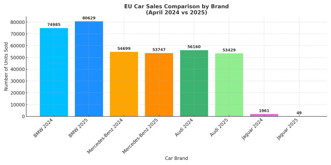
That response crystallized the embarrassment. It wasn't just that the rebrand was bad; it was that the company seemed unable to recognize how bad it was. The design chief, when asked about the creative direction, assured journalists that his team hadn't been "sniffing the white stuff." The managing director dismissed critics as purveyors of "vile hatred" and insisted that "a new Jaguar shouldn't land and everybody goes, yeah that's nice." By April 2025, European sales had collapsed by ninety-seven and a half percent year-over-year, from 1,961 vehicles to forty-nine. The design chief was escorted out of the office. The CEO announced his retirement. The parent company's stock had shed an estimated seven to seventeen billion dollars in market value.
The more Jaguar protested, the worse it looked. That's the signature dynamic of embarrassment: defensiveness only deepens it. You cannot argue your way out of cringe.
Blanding and the Loss of Identity
There's a term in the design industry for what Jaguar was attempting: "blanding." The word was coined by Thierry Brunfaut of the branding agency Base Design, and it describes the tendency of corporate identities to converge on a single aesthetic. Clean sans-serif type, lots of white space, minimal ornamentation, interchangeable across industries. "Brands are like people," Brunfaut wrote. "Which is precisely why I'm so baffled by the current epidemic of what I call blanding, branding designed not to stand out at all, but to blend in."
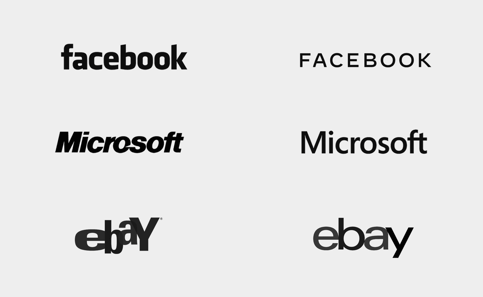
The defense of blanding is functional. Logos now have to work across an impossible range of contexts: app icons, browser tabs, social media avatars, smart-watch faces, billboards. A Victorian crest might look distinguished on a building facade, but it becomes an unreadable smudge at sixteen pixels. The simplification trend is, in this sense, a reasonable response to technological constraint. But it's also produced a landscape where every new logo looks like it could belong to a wellness startup, a fintech platform, or a plant-based meat alternative. When Austin's critics compared the new city mark to Dallas's logo, they weren't wrong. The two are strikingly similar, both featuring stylized letter forms in blue. The specificity had been designed out.
Brunfaut's critique is sharp: "Blands are like teenagers. They dress the same, talk the same, act the same... In identifying themselves through the looks and mannerisms of others, the only thing blands are saying about themselves is that they don't have anything to say about themselves."
Economic Context and Institutional Priorities
This is where economic context enters the picture. Rebrands are expensive, and that expense becomes harder to justify when citizens or customers are struggling. Austin's million-dollar logo arrived during a budget crisis. Cracker Barrel's rebrand was part of a seven-hundred-million-dollar "modernization effort" at a chain whose customers come precisely because it hasn't modernized. Jaguar was pivoting to ultra-luxury electric vehicles at price points starting around $120,000. The strategy might make sense internally, but it reads to the public as abandoning the people who actually buy Jaguars.
The design writer Niklas Mortensen captured this dynamic well: "Since the financial crisis of 2008, we seem to be living through one generational crisis after the other. And people are tired. In constant crisis mode, even a subtle logo tweak can feel like one disruption too many." The rebrand becomes a proxy for larger grievances about institutional priorities, about the gap between corporate self-image and public reality, about the sensation of being managed rather than served.
How Indeed Rebranded
I work in creative direction at Indeed, and I think about our logo a lot. It's a little dorky, if I'm being honest. A rounded blue wordmark with a swoosh over the "i" that looks more like something from the early dot-com era than the sleek minimalism of contemporary tech branding. It was designed by the spouse of one of the founders back when the company launched in 2004, and it has change exactly once. We changed the shade of blue and removed the registration mark for legal reasons. No rebrand, no refresh, no consultants, no million-dollar invoices. The same slightly goofy mark has represented the company from startup to the world's largest job site.

And here's the thing: it works. Not because it's a masterpiece of design, but because it's familiar. Because it has meaning accumulated through use rather than meaning manufactured through strategy decks. Because no one had to defend it in a press release or explain what the new font symbolizes. It just existed, and kept existing, and became ours.
I also think about what would happen if Indeed did rebrand. If the company hired a global consultancy, produced a splashy campaign, unveiled a new wordmark with a press release about "evolving our visual identity to reflect our commitment to the future of work." I think the reaction would be brutal, and not because the design would necessarily be bad. It would be brutal because of context.
Indeed's customers are job seekers and employers, and both groups are under extraordinary stress right now. The job market has grown increasingly brutal, with AI-driven automation reducing headcounts while shareholders demand ever-greater returns. People are applying to hundreds of positions and hearing nothing back. Hiring managers are being asked to do more with smaller teams and tighter budgets. The anxiety is pervasive and justified. In that environment, a flashy rebrand wouldn't read as innovation or evolution. It would read as tone-deafness. It would read as a company spending money on optics while its users struggle with the fundamental problem the platform exists to solve.
The reaction, I suspect, would mirror what happened in Austin: a sense that the institution had revealed its priorities, and those priorities weren't aligned with the people it claims to serve. The logo would become a symbol of misplaced effort, of resources that could have gone toward making the product better or the experience less frustrating. The cringe wouldn't be about the design. It would be about the disconnect.
Should Designers Ignore Logo Criticism?
There's a counterargument to all of this, and it's worth taking seriously. Michael Bierut, one of the most respected graphic designers alive, has pointed out that early criticism of logos is often meaningless. People hated the London 2012 Olympics logo when it was unveiled; by the time the games ended, it had become iconic. The initial response, Bierut argues, reflects not the quality of the design but the intensity of people's attachment to the status quo. "Those people are the loyal fans," he says. "The passion that makes them sit in those seats when the weather is terrible is the same passion that is going to make them take it personally."
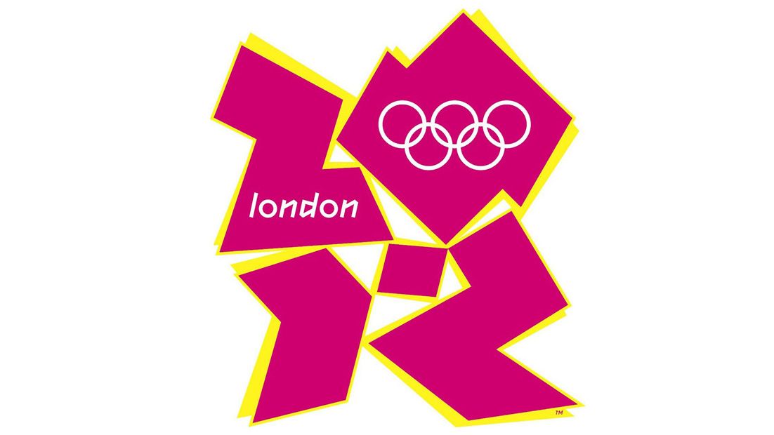
Still, the consequences can be real enough. Cracker Barrel didn't reverse its logo because of mean tweets; it reversed its logo because the stock dropped seven percent. Jaguar didn't lose its design chief because of TikTok mockery; it lost its design chief because sales collapsed. The social-media pile-on is the visible part of a reaction that has material effects. Whether the criticism is fair, whether the design itself is actually bad, becomes almost irrelevant. The perception of embarrassment creates the reality of failure.
Chill Out With the Rebrands
We live in an era of intense self-consciousness about self-presentation. Everyone is a little bit of a brand now, and everyone understands the risk of trying too hard, of seeming desperate for relevance, of broadcasting a version of yourself that doesn't survive contact with reality. When institutions do it badly, when they spend a million dollars on a logo that says nothing or launch a campaign so tone-deaf it becomes a meme, we recognize the failure because we're all afraid of making the same mistake. The cringe is a mirror.
When Jaguar's managing director insisted that critics were motivated by "vile hatred," he was only making it worse. When Austin's city council approved a million-dollar branding contract one month after staff highlighted a three-and-a-half-million-dollar shortfall, they weren't making a design decision. They were making a values statement, and the public received it as such.
The solution, if there is one, might be restraint. Don't announce the rebrand; let it emerge. Don't hire a global consultancy; hire someone who actually understands your context. Don't optimize for stakeholder consensus; optimize for having something to say. The logos that survive aren't the ones that avoided objections in the boardroom. They're the ones that meant something to the people who made them.
Or maybe the solution is simpler: just don't. If your current logo works, if it carries meaning and history and recognition, maybe the brave choice is to leave it alone. In a world where change itself has become suspect, where every pivot invites scrutiny and every refresh risks ridicule, there's something to be said for staying put. The least embarrassing thing you can do, sometimes, is nothing at all.